Paris University Club – Ultimate – Identity & Jersey Design
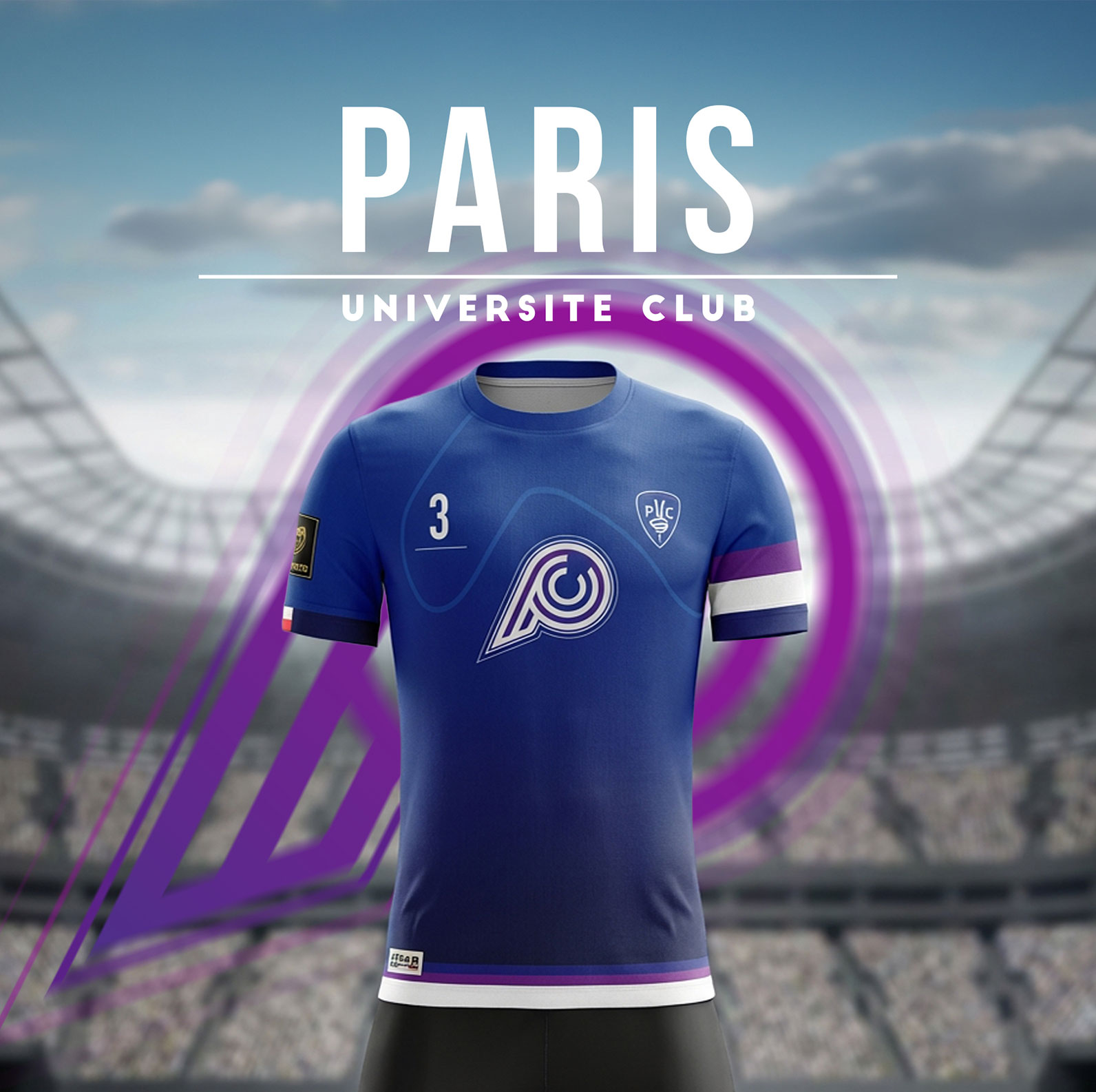
Paris Université Club has been around since 1906, with over 9,000 members and 45 sports disciplines — the club’s long-standing visual identity wasn’t something to touch. Its Ultimate Frisbee section, however, which competes in France’s top division and represents the club at European and World championships, needed something of its own: a logo instantly recognisable on any field, and a jersey that matched its ambitions. The PUC Ultimate team came to me with that brief, and I’m grateful for the trust they placed in me to shape this new identity.
After an initial sit-down with coaches and team captains, we laid the groundwork together. The logo had to feature the letters PUC — an obvious link to the historic club — but in a stylised way, with real athletic energy. The goal: for the monogram’s shape alone to convey the motion of a disc in flight or the dynamics of a throw, without needing any explanation. On the jersey side, two colourways: a deep navy as the primary kit, and a white alternate for matches against teams with similar colours — the lighter version being able to incorporate more visual elements if needed. Everything had to remain strictly unisex.
I explored several directions around the tension between typography and movement, eventually arriving at a PUC monogram whose internal curves echo the arc of a forehand throw — giving the logo a sense of direction and speed, even at a standstill. Every iteration was designed from the start in both dark and light versions to ensure legibility across both kit variations. Once the design was approved, I worked directly with the textile manufacturer to take the concept to finished product: colour calibration, logo and number placement, sponsor zones, and sublimation specs. The system now accompanies PUC Ultimate’s open, women’s and mixed teams across the national and European circuit